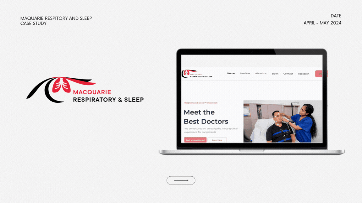
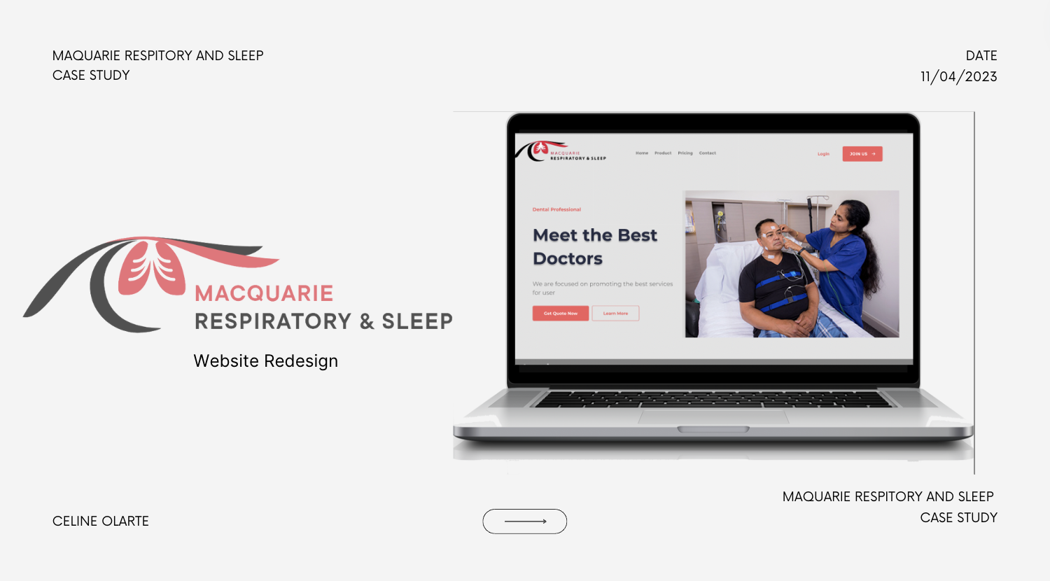
Product Overview
This UX Case Study on Macquarie Respiratory and Sleep’s website focuses on enhancing user experience in the field of respiratory and sleep. Through meticulous research, user-centered design, and iterative testing, we have developed innovative solutions to address the diverse needs of patients.
Problem Statement
To create intuitive and user-friendly interfaces for our respiratory and sleep products, ensuring seamless interaction and optimal usability across different user groups, including patients, caregivers, and clinicians. Additionally, we aimed to integrate advanced features and customization options to enhance therapy effectiveness and patient outcomes.
Goals
“To design the most optimal engaging website for patients, specifically the elderly that educates them about Macquarie Respiratory and Sleep’s company and allows for customers to schedule appointments and obtain referrals”
Design Process
For the Macquarie Respiratory and Sleep Website, I began with targeted research and gained insight from medical professionals. Post-research, I embarked on an ideation session, creating initial wireframes that merged recognition of features rather than recall with interactive elements. Through iterative design, testing, and feedback the final interface was honed to be both engaging for the elder audience and general partners and more informative about non-clinical healthcare careers.


User Research
I conducted user research focus groups. These insights coupled with interviews with healthcare stakeholders, shaped our understanding of the target audiences' needs and preferences, guiding the design strategy for an engaging and innovative experience.
Competitive Analysis
Websites like “Woodcock “ and “Peninsula “ offer content specialized for each patient, and offer a seamless user flow that is easy to follow as a new user of the website. These websites also include a unique opportunity to blend various challenges and create real-world connections, distinctly positioning itself in the health sector.

Observations
We used qualitative research to better understand the perceptions and interests of the elderly regarding their grievances and preferences with interface features. Through screener questions, we can identify participants based on their age, frequency of digital device usage, experience with apps, and familiarity and interest in healthcare.
SCREENERS
On a scale of 1 to 10, how satisfied are you with the information provided on our website regarding respiratory health?
How often do you visit our website for information related to respiratory and sleep issues?
Have you found the information on our website helpful in managing your respiratory condition?
How likely are you to recommend our website to others seeking information on respiratory and sleep disorders?
Which specific sections or pages of our website do you find most useful for addressing your respiratory concerns

Pain Points
1. Lack of Awareness
Many elderly may not be aware of how each feature of the website functions as the current website does not implement a simple streamlined way of navigation.
2.No Consistent Font
There is no consistent font found within the website. This creates a cluttered viewpoint of the website.
3.Overwhelming Choices
The layout of the website may overwhelm the user with too many options about which direction to explore or consider within the website.
Generating the Final Improved Design
A quick rundown of design suggestions and improvements to develop the current Macquarie Respiratory and Sleep website. These next few slides represent the proposed design.
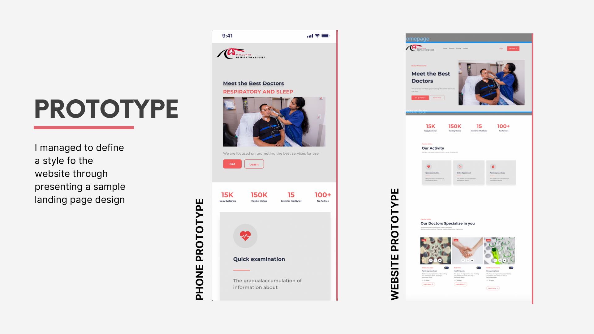


Main Features of the Design
Nelsons Heuristic Evaluation:
1) Recognition Rather than Recall
This new design promotes recognition rather than recall by incorporating a more organized layout for the header, it also condenses the initial website layout of information by merging the contents of various pages into 1. It also helps the referral forms all in on the platform rather than being somewhat scattered. It also reorganizes doctors' research and studies more easily, through article form and ensures easy navigation and readability for the user involved.
2) Minimalistic Design
The minimalistic design of the website also helps to guide the user as its simplistic shapes and colour palette emphasise ease and create a smoother usage of the website for the user. I made sure to minimise the use of red within the colour palette to not distract the user. I also streamlined all fonts for visual consistency and a more professional look overall.
Key Takeaways
The result of our UX case study is a suite of respiratory and sleep products that prioritise user experience and usability. Key outcomes include:
Intuitive interfaces that streamline therapy setup and adjustment for patients.
Customisation options that allow clinicians to tailor therapy settings to individual patient needs.
Enhanced data visualisation and analytics tools for healthcare professionals to monitor patient progress and outcomes.
Roadmap
Moving forward for this project we need to ensure that all research and task development is taken to account and used within the website development. This project will move forward through constructing it in Web flow. I will create the features in accordance with what I have proposed, and continue to actively seek feedback.
If all designs are approved, the next stage would be converting it to a functioning website