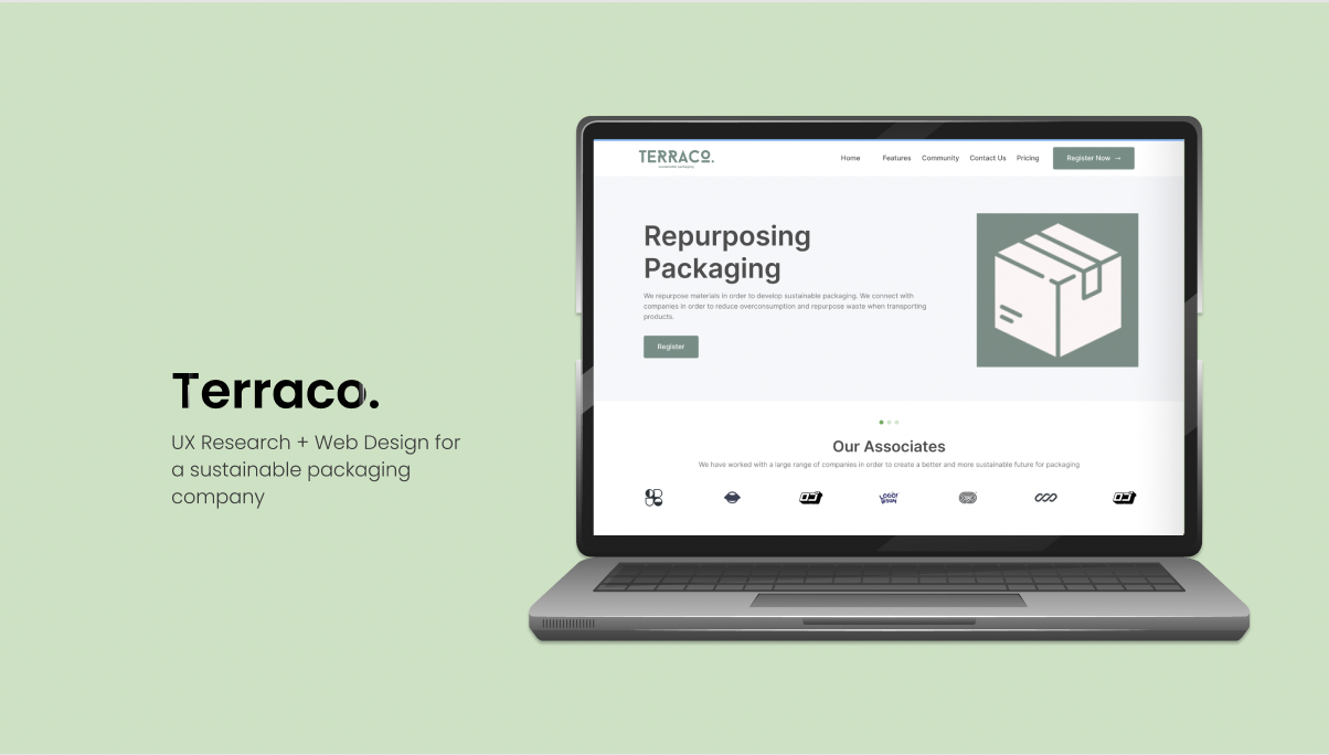
Project Overview
I managed to design an website for Terraco. This company is a University directed project in collaboration with other designers from other specialisations (Industrial, Product, Graphic, etc.). I was tasked with creating the branding of the company and website design. Terraco’s websites primary goal is to successfully convey the companies commitment to sustainability by utilising these essential elements and design concepts, all while giving users an enjoyable and intuitive experience
Timeline
10 Weeks
My Role
UX Designer
Goals
To create a minimalist and informative design which captures the essence of Terraco’s aim for sustainable packaging
Create a smooth and seamless user experience for those using the site, through the development of a multitude of iterations and user testing
Include ordering features and other buttons that can better show the functionality of the application
Heuristic Evaluation
Minimalist Design: To try and best organise information as effectively as possible. This helps users easily navigate the website.
Recognition Rather than Recall: Our website thoroughly adapts Nelsons Heuristics in order to create an effective and good design. It ensures that the user experience is effective.
User-friendly navigation: to make it simple for users to locate their goods they are looking for, ensuring navigation is intuitive and has clear categories, menus, and search capabilities
Features
Testimonials and Case Studies: This section includes the case studies of effective sustainable packaging solutions used by companies in a range of industries, as well as testimonial from happy customers
Sustainability Indicators: To clearly express EcoCrafts environmental impact, providing graphic representation of the brands sustainability indicators. .
Process
Low-Fidelity Prototype and Medium Fidelity Prototype
Below we can see various prototypes and fidelity’s, these were developed in order to create the best results for the UX design. This part was essential to creating an optimal design.
1) Recognition rather then recall
This design promotes recognition rather then recall through:
Giving clear instructions
Eliminating Unnecessary Functions
Collaboration
Individual Project
Platform
Figma

Heuristic Evaluation
2) Error Prevention
This design promotes error prevention through encouraging users through:
Gamifying the experience
Designing self explanatory interfaces
Final Design


Product Successes
The design of this project encapsulates a simple and aesthetic design through using a minimalist colour palette, simplistic text. Overall this product manages to generate a consistent design throughout.
What I learned
Throughout this project I have managed to increase my knowledge on creating an effective set of wireframes. I have also managed to improve on my collaborations skills through sharing my designs with another designer in order to streamline the visuals and iconography needed to develop this website.